The Art of Creating Memorable User Interfaces in Video Games
26 July 2025
Let’s be real for a second—when we think back on our favorite video games, we often remember the epic boss fights, gripping storylines, and heart-racing game mechanics. But there’s one unsung hero behind all of that magic: the user interface (UI). Think about it—without a solid UI, you’d be fumbling through menus, struggling to find the map, or misreading your health bar mid-battle. Not fun.
Creating a user interface that’s not just functional but also memorable? That's an art form. UI might not be the flashiest part of game development, but, oh boy, it can make or break the entire gaming experience.
So, grab your controller (or mouse), and let’s dive into the secrets of designing UI that sticks in players’ heads long after the credits roll.
What Is a Video Game UI Anyway?
Before we go full throttle, let’s break it down. “User Interface” in the context of video games refers to everything you, the player, interact with to access game information or features. That means HUDs (Heads-Up Displays), menus, maps, health bars, skill wheels, inventory screens—you name it.If it's helping you control the game or understand what the heck is going on, it's UI.
Why UI Matters More Than You Think
Some folks think UI is just a collection of buttons slapped on a screen. But in reality, great UI does so much more:- Guides Player Behavior: It quietly nudges you in the right direction.
- Enhances Immersion: A well-designed UI keeps you in the game world without yanking you out of the experience.
- Improves Accessibility and Usability: The right UI makes a game enjoyable for both hardcore and casual players.
- Communicates Information Instantly: Whether you're at full health or one axe swing away from doom—UI tells you that in a flash.
Bad UI, on the other hand? That’s friction, frustration, and sometimes even rage-quits.
Core Elements of a Memorable Video Game UI
Let’s break down the DNA of iconic video game UIs. These are the must-haves if you want to create something that truly resonates with players.1. Simplicity Without Sacrificing Depth
One of the golden rules? Don’t overload the player.Think about the UI in games like Journey or Inside—you barely notice it. That’s intentional. They’re minimalist but still deliver a rich experience. Simplicity doesn’t mean stripping away functionality; it means showing only what’s necessary at any given moment.
Want an example from the other side? Try navigating the cluttered menus of overly complex RPGs that don’t prioritize clarity—yikes.
2. Consistency is Key
Ever tried a game where the pause menu looks like it came from a different universe than the skill tree? That’s a big no-no.Good UI sticks to a cohesive visual language—consistent fonts, icons, animations, and spacing. The Legend of Zelda: Breath of the Wild nails this. Everything from the inventory to the cooking menu looks and feels like it belongs in the same world.
3. Fast and Intuitive Navigation
Here’s the deal: if players are spending more time navigating menus than playing the game, something’s broken. Efficiency is everything.Quick access to settings, inventory, or quests without 12-click marathons = happy players.
A great example? Destiny 2’s “press and hold to equip” UI behavior. It feels quick, but also adds intentionality to avoid mistakes. Smart, right?
4. Feedback, Feedback, Feedback!
Your game’s UI should talk back—not literally (unless that’s your thing)—but by giving players feedback for their actions.Clicked a button? Make it flash or pop. Navigated to a new section? Give an animation or sound cue. These micro-interactions are the little dopamine hits of UI.
God of War (2018) used subtle UI sounds and haptics to make even the menu feel satisfying. That’s attention to detail.
UI vs. UX: What’s the Difference?
Quick sidebar—because these terms often get mashed together:- UI (User Interface): The visuals and interactive elements.
- UX (User Experience): The flow, feel, and overall experience of the player as they interact with your UI.
Think of UI as the steering wheel, and UX as the entire driving experience. It’s possible to have a beautiful UI but a terrible UX if the navigation is clunky or confusing.
A memorable UI needs both working in harmony.
Case Studies: Games That Nailed Their UI
Let’s look at some real MVPs when it comes to game UI. These games didn’t just do it right—they made it iconic.1. Dead Space – Diegetic UI Done Right
Remember how health, ammo, and stasis indicators are embedded directly into Isaac’s suit and weapons? That’s diegetic UI—where the interface is part of the game world. It’s immersive and brilliant.No HUD clutter. No disconnect. Just seamless integration that makes the horror feel even more real.
2. The Witcher 3 – Deep UI With Great Customization
With so many stats, quests, and items, this game could’ve gotten confusing fast. But it didn’t. Why? Because the UI gives players control.You can customize the HUD, toggle elements on and off, and navigate huge menus with ease. Pro tip: Give players options. It goes a long way.
3. Persona 5 – Stylish Meets Functional
This game is a masterclass in UI as an art form. Its bold, comic-inspired interface isn’t just eye candy—it’s super usable.Navigating fights feels fluid. Menus are animated in stylish swipes and slashes. You could watch someone navigate the UI and still have fun.
That’s rare.
The Importance of Animation and Transitions
Animations aren’t just there to look pretty—they serve a serious purpose.A smooth transition from menu to gameplay reduces cognitive load. It helps the player’s brain keep up. Think of it as a visual handshake that says, “Hey, you’re going from A to B, and here’s how.”
Horizon Zero Dawn does this beautifully. Switching weapons or opening the map has smooth transitions that keep the pace flowing.
Accessibility: Designing for Everyone
One of the most crucial (and often overlooked) parts of UI design is making sure that everyone can enjoy your game—regardless of physical or cognitive limitations.Small text? Confusing color choices? No subtitle options? That’s a slap in the face to inclusivity.
Games like The Last of Us Part II are setting the bar here. With customizable UI elements, text-to-speech, colorblind modes, and more—it shows just how far empathetic design can go.
Cultural Factors That Affect UI Design
Fun fact: UI that works great in one region might flop in another. That’s because different cultures interpret icons, colors, and layouts differently.Something as simple as a skull icon might be badass in the West, but inappropriate in parts of Asia. Localization isn’t just about translating text—it also means adapting your UI symbols, layouts, and interactions for global sensibilities.
So, don’t just think locally. Think globally.
Building Emotional Connection Through UI
Okay, let’s get a little “artsy” here. UI isn’t just tech—it’s storytelling.The way a health bar depletes, the sound a menu click makes, the animations when you level up—these all affect how a game feels. It’s digital body language, and like all body language, it sets the tone.
Ever open your inventory during a fight in Dark Souls and hear that ominous clicking noise? That’s not just utility—it’s emotion. It adds to the weight and tension of the game.
When you craft UI with emotion in mind, you’re crafting something unforgettable.
Designing UI for Different Platforms
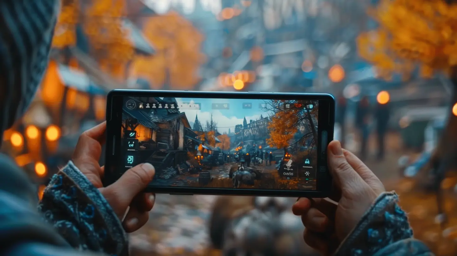
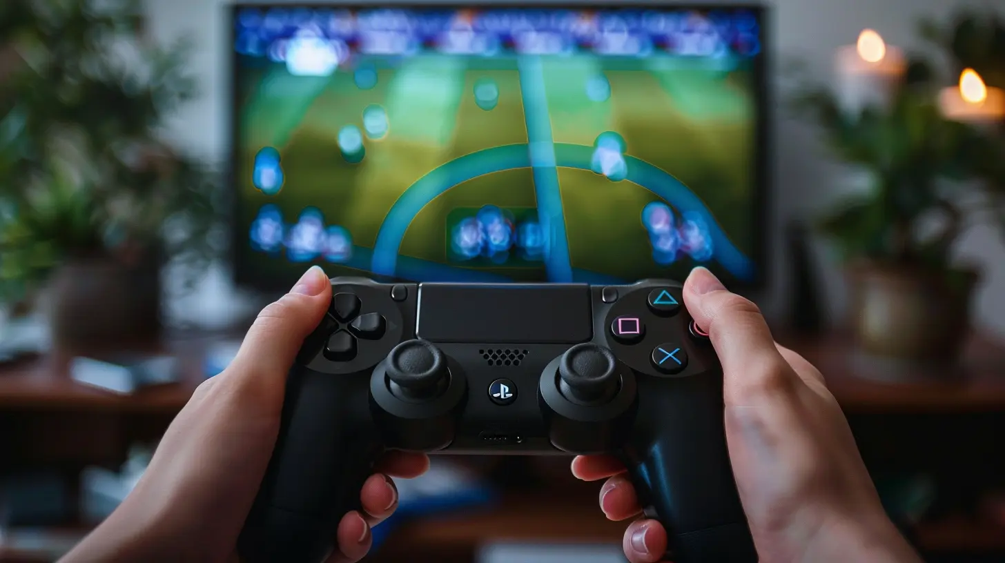
A UI that works wonders on PC might faceplant on mobile or console. Why? Because the input methods (mouse, controller, touchscreen) are wildly different.- PC UIs often prioritize hover states and tiny icons.
- Console UIs need larger buttons and D-pad-friendly navigation.
- Mobile UIs live and die by their touch responsiveness and screen space management.
Adapting your UI per platform is key. Don’t just port; optimize.
Tools and Tips for Aspiring UI Designers
Alright, future UI maestros, here are some tools and tidbits to get you started:Tools of the Trade
- Figma or Adobe XD for mockups and flows- Unity / Unreal Engine for actual implementation
- Illustrator / Photoshop for asset creation
- After Effects for UI animations
Hot UI Tips
- Prototype early and often.- Watch real people play your UI (you’ll learn a lot).
- Prioritize contrast and readability.
- Keep iconography simple and uniform.
- Less is more—don’t be afraid of white space.
Wrapping It Up: UI is the Player's Best Friend
At the end of the day, a memorable UI isn't about being flashy or complex. It’s about supporting the player—being there when they need it, fading into the background when they don’t, and always making the experience better rather than more complicated.Great UI feels invisible… until it's not there. Then you realize just how much it mattered all along.
So whether you're building an indie game in your basement or leading a AAA team, never underestimate the power of thoughtful, creative UI design. It could be the difference between a game that’s played and one that’s loved.
all images in this post were generated using AI tools
Category:
Video Game GraphicsAuthor:

Brianna Reyes
Discussion
rate this article
2 comments
Mila Griffin
Creating memorable UIs is like dating—if it’s confusing, messy, or crashes unexpectedly, you’ll be swiping left faster than you can say 'game over!' Let’s keep it charming and smooth!
February 11, 2026 at 6:07 AM

Brianna Reyes
Absolutely! Just like in dating, clarity and smooth interactions are key to keeping players engaged. Well put!
Skyler Miller
Creating a memorable UI is like making a perfect sandwich: too much mustard and your players are confused, too little and it’s just dry bread. Let’s aim for gourmet, not a game of ‘What does this button do?’!
August 9, 2025 at 3:20 AM

Brianna Reyes
Absolutely! Finding that balance is key to engaging players and enhancing their experience. A gourmet UI should be intuitive and enjoyable, guiding players seamlessly through the game.

